Peter Strain & Corey Brickley / Communication Arts 2017 Illustration Competition Winners
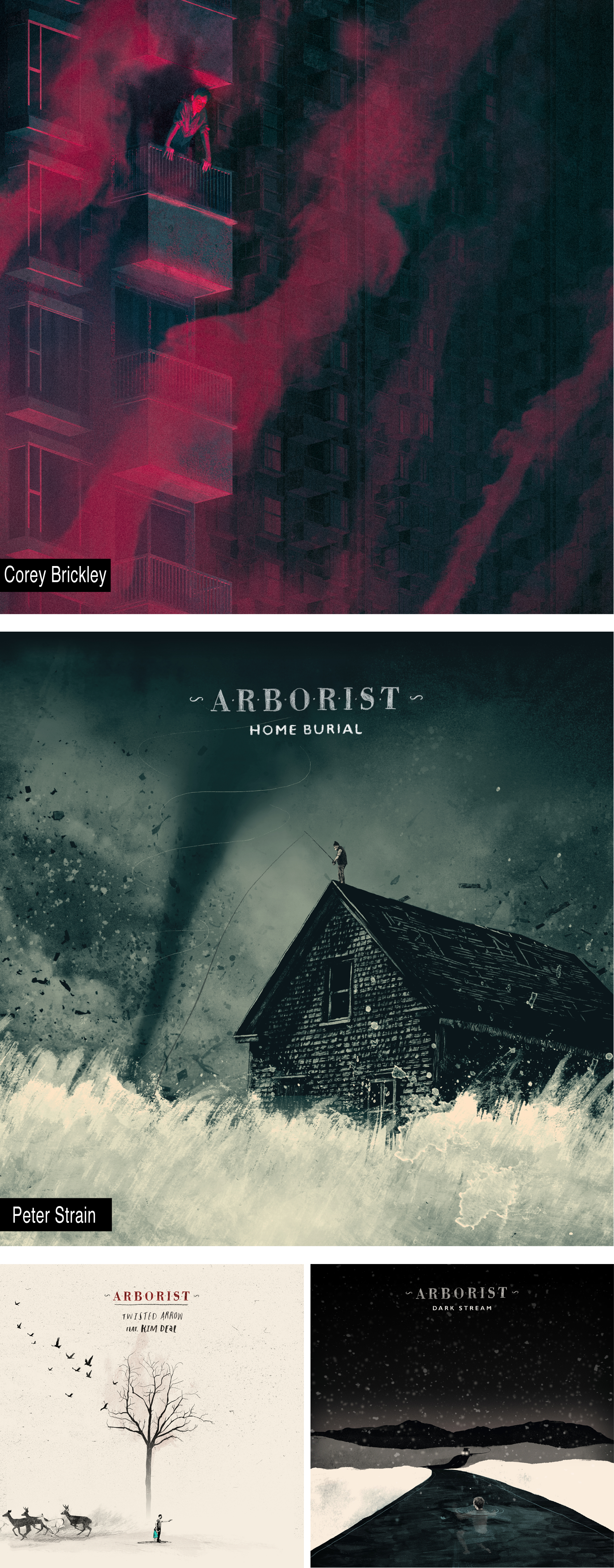
We are delight to share the news that Corey Brickley and Peter Strain are proud winners of the Communication Arts 2017 Illustration Competition, receiving an Award of Excellence. Corey Brickley for his dramatic album cover artwork for the release of Blood Youth’s debut album ‘Beyond Repair’ and Peter Strain for not just 1 but 3 covers produced for Arborist’s debut album ‘Home Burial' & 2 singles.
Of the 3,995 entries to the 58th Illustration Annual, only 178 were accepted, representing the work of 159 artists, making the Illustration Annual the most exclusive major illustration competition in the world.
Published each May, the Illustration Annual incorporates special reproduction techniques developed by CA, including quality 200-line colour separation and printing on premium 70 lb. coated paper by one of the finest printers in the United States. Everything that was originally in colour is reproduced in colour at a size that allows the concept to be understood.
About Communication Arts
Communication Arts is a professional journal for designers, art directors, design firms, corporate design departments, agencies, illustrators, photographers and everyone involved in visual communications. Through its editorials, feature articles and the annual competitions it sponsors, CA provides new ideas and information, while promoting the highest professional standards for the field.
For over 58 years, CA continues to showcase the current best—whether it’s from industry veterans or tomorrow’s stars—in design, advertising, photography, illustration, interactive and typography. Everything is reproduced with printing technology and attention to detail unmatched by any trade publication anywhere.
With a paid circulation of over 30,000 (29,351 subscribers and 2,336 single copy sales), CA has a rich tradition of representing the aspirations of a continually-growing and quality-conscious field of visual communications. CA’s editorial content, knowledgeable presentation and writing, use of colour and quality reproduction are all designed to be consistent with the standards CA’s readers set for themselves in their own careers.
Follow these links to view the complete illustration and motion portfolio's for Corey Brickley and Peter Strain


Recent articles

Justin Metz / Prisoner / SKY
Justin Metz worked with the team at Sky creative on the key visual for their new series 'Prisoner'. The artwork is up on 48 sheets around the UK right now. You can see more of Justin's work here

Max Loeffler / All Conditions Express / Nike
Max Loeffler created this excellent illustration for Nike's ACG All Conditions Express out of home campaign. The key visual was adapted too many different formats such as posters, postcards, stickers and various merchandise items. You can see more of Max's work here

Début Welcomes Marcial Rodrigo
Début Art is very excited to announce that we are now representing Marcial Rodrigo! Marcial is an illustrator and infographic designer from Seville, in the sunny south of Spain, who explores ways to fuse information with illustration. Detail-oriented and versatile, he combines simplicity and symbolism to communicate complex ideas clearly and effectively. With a style defined by precise, dynamic lines, his compositions balance visual and conceptual harmony, prioritizing both aesthetics and clarity—creating pieces that connect and invite visual reflection. His professional background, which spans from architecture to design, brings a unique perspective to his work. Now based in Málaga, he works with national and international clients, developing projects that deliver narrative depth and visual coherence. Clients include: El País-Retina, Santilla Editorial, Arup, Oliver Cabell, Fast Company, Modus Magazine, Golf Magazine, Drapers, Which? Magazine, Wunderman Thompson, Garaje de Ideas,...

A Rich Rice Brand Re-design
We are pleased to share packaging illustrations by artist Webb Creative for Oriente, a premium rice brand out of Portugal. Webb Creative was brought on by Firecactus Creative Director John-Paul Hunter who led the brand’s redesign. Inside the V-shaped illustration, which is actually two grains of rice coming together, are Webb’s illustrations. Each rice variant has a different scene, depicting the fifth-generation owners and moments from the business’s history. As Hunter shared with Design Week: “That illustration needed to work hard, we wanted people to see something different every time.” A further dive into the meaning of each illustration can be found on the back of the pack. You can check out details of the redesign and more of Webb Creative’s work here.