BloodBros Winner of the Barbican Sci-Fi Print Competition!
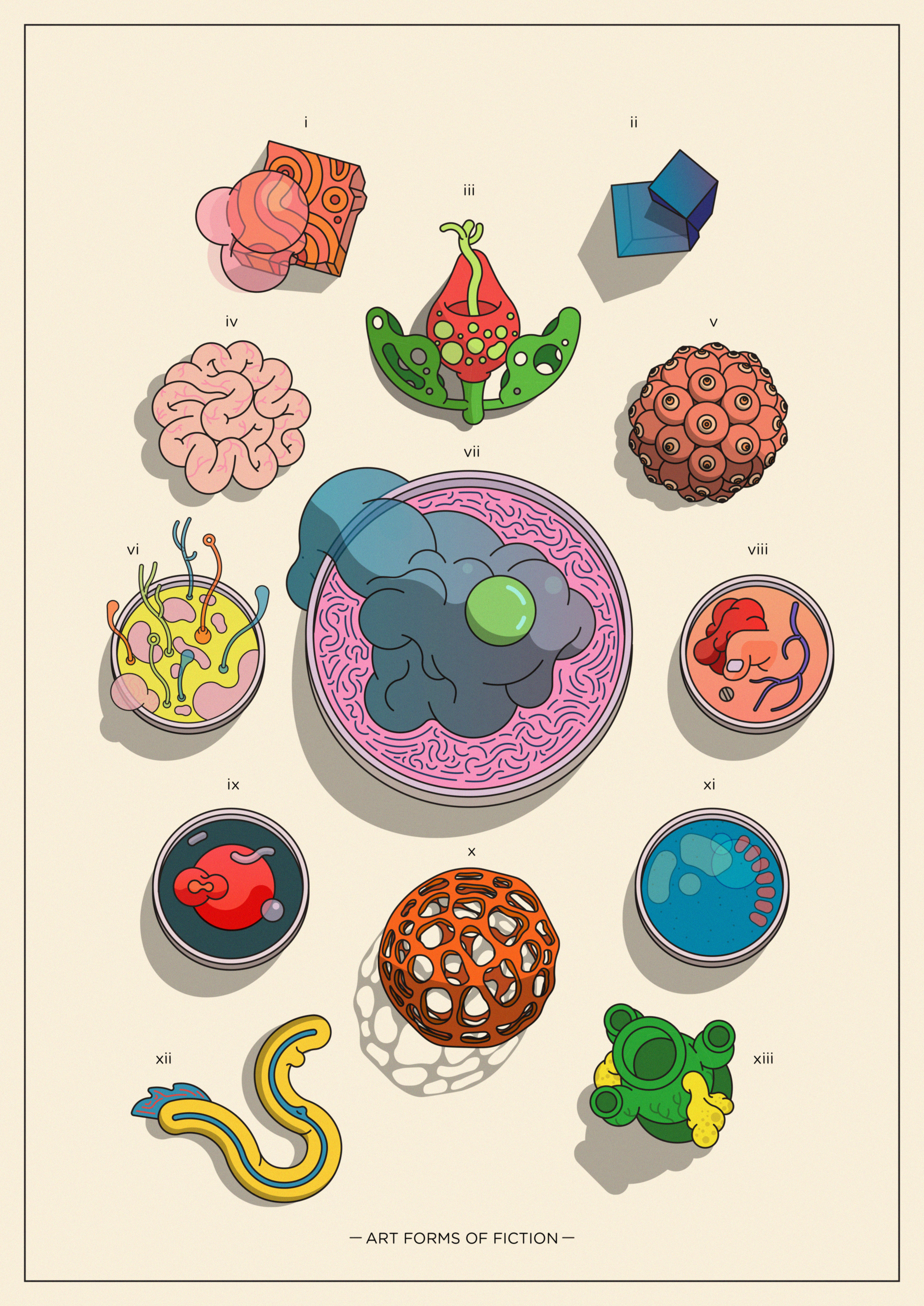
We are very proud to announce that BloodBros, AKA Emile Holmewood, has won the Barbican and Wrap Magazine’s print competition with his poster, ‘Art Forms of Fiction’!
The competition was announced in the lead up to the Barbican’s major upcoming exhibiton, ‘Into the Unknown: A Journey through Science Fiction,’ opening in June. The exhibition is an exploration of one of popular culture’s most celebrated genres, which spans film, music, literature and contemporary art, and will 'present a new, global perspective on Science Fiction’.
Emile says, ‘I've taken inspiration from Ernst Haeckel's 'Art Forms of Nature', creating a specimen sheet of sci-fi related themes: i: 'Host' ii: 'Rock' iii: 'Flora' iv: 'Intelligence' v: 'Mother' vi: 'Bubblegum' vii: 'Slime' viii: 'mutation' ix: 'A.I.' x: 'Sea life' xi: 'light/reflection' xii: 'Alien life' xiii: 'sound'. In several cases the specimens draw influence from specific movies/books.’
The competition was judged by Into the Unknown curator, Patrick Gyger; as well as Barbican buyer, Margaus Soland; freelance illustrator and animator Tom Clohsy Cole; Wrap editor, Polly Glass; and Wrap Creative Director, Chris Harrison. BloodBros won the overall competition, with the judges commenting, ‘This is a really exciting response to the brief. It probes our visions of the future with exciting imaginations of organic lifeforms and oozes fun. When I first saw this print I was struck by its visual power and when I started reading about the concept behind it I was all the more impressed. This entry was the most well rounded and accomplished, a truly inventive take on the theme.’
You can see the exhibition from 3 June – 1 September 2017, and the prints will be available to buy in the Barbican store.
Well done Emile, we are very proud!
View BloodBros full portfolio here
Related artist
Emile
Recent articles

Justin Metz / Prisoner / SKY
Justin Metz worked with the team at Sky creative on the key visual for their new series 'Prisoner'. The artwork is up on 48 sheets around the UK right now. You can see more of Justin's work here

Max Loeffler / All Conditions Express / Nike
Max Loeffler created this excellent illustration for Nike's ACG All Conditions Express out of home campaign. The key visual was adapted too many different formats such as posters, postcards, stickers and various merchandise items. You can see more of Max's work here

Début Welcomes Marcial Rodrigo
Début Art is very excited to announce that we are now representing Marcial Rodrigo! Marcial is an illustrator and infographic designer from Seville, in the sunny south of Spain, who explores ways to fuse information with illustration. Detail-oriented and versatile, he combines simplicity and symbolism to communicate complex ideas clearly and effectively. With a style defined by precise, dynamic lines, his compositions balance visual and conceptual harmony, prioritizing both aesthetics and clarity—creating pieces that connect and invite visual reflection. His professional background, which spans from architecture to design, brings a unique perspective to his work. Now based in Málaga, he works with national and international clients, developing projects that deliver narrative depth and visual coherence. Clients include: El País-Retina, Santilla Editorial, Arup, Oliver Cabell, Fast Company, Modus Magazine, Golf Magazine, Drapers, Which? Magazine, Wunderman Thompson, Garaje de Ideas,...

A Rich Rice Brand Re-design
We are pleased to share packaging illustrations by artist Webb Creative for Oriente, a premium rice brand out of Portugal. Webb Creative was brought on by Firecactus Creative Director John-Paul Hunter who led the brand’s redesign. Inside the V-shaped illustration, which is actually two grains of rice coming together, are Webb’s illustrations. Each rice variant has a different scene, depicting the fifth-generation owners and moments from the business’s history. As Hunter shared with Design Week: “That illustration needed to work hard, we wanted people to see something different every time.” A further dive into the meaning of each illustration can be found on the back of the pack. You can check out details of the redesign and more of Webb Creative’s work here.