Tobias Hall / Warburtons
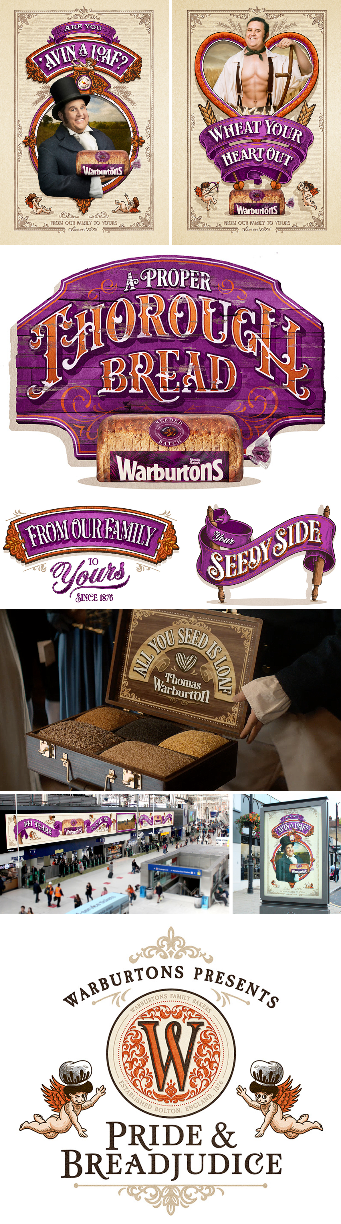
We're delighted to share the outcome of Tobias Hall's collaboration with WCRS for the latest Warburtons nationwide campaign, a mammoth project that called on Tobias to create an aesthetic identity for their nationwide print and digital campaign.
Warburtons has become well known for its blockbuster approach to advertising, and they made no exception for their latest offering. British-born comedian Peter Kay was called upon to be the heart, face and indeed body of the Regency-era epic drama, a bread-themed parody of Jane Austen's 'Pride and Prejudice'.
In creating the still assets to accompany the television spot, Tobias maintained the 19th Century look and feel of the advert. He sought inspiration from hand-painted adverts of the period, bringing them up to date with a modern and lighthearted twist in keeping with the humour of the campaign and with Warburtons' instantly recognisable branding.
Tobias' particular ability to create rich, intricate designs that are both refined and dynamic is on full display here, with his attention to detail making each design unique in its own way whilst remaining cohesive as a poster series.
The resulting posters are on display nationwide, and more of the posters can be seen in full here, here and here. You can also learn more about Tobias and view more of his work online by clicking here.
Related artist
zTobias zHall
Recent articles

Justin Metz / Prisoner / SKY
Justin Metz worked with the team at Sky creative on the key visual for their new series 'Prisoner'. The artwork is up on 48 sheets around the UK right now. You can see more of Justin's work here

Max Loeffler / All Conditions Express / Nike
Max Loeffler created this excellent illustration for Nike's ACG All Conditions Express out of home campaign. The key visual was adapted too many different formats such as posters, postcards, stickers and various merchandise items. You can see more of Max's work here

Début Welcomes Marcial Rodrigo
Début Art is very excited to announce that we are now representing Marcial Rodrigo! Marcial is an illustrator and infographic designer from Seville, in the sunny south of Spain, who explores ways to fuse information with illustration. Detail-oriented and versatile, he combines simplicity and symbolism to communicate complex ideas clearly and effectively. With a style defined by precise, dynamic lines, his compositions balance visual and conceptual harmony, prioritizing both aesthetics and clarity—creating pieces that connect and invite visual reflection. His professional background, which spans from architecture to design, brings a unique perspective to his work. Now based in Málaga, he works with national and international clients, developing projects that deliver narrative depth and visual coherence. Clients include: El País-Retina, Santilla Editorial, Arup, Oliver Cabell, Fast Company, Modus Magazine, Golf Magazine, Drapers, Which? Magazine, Wunderman Thompson, Garaje de Ideas,...

A Rich Rice Brand Re-design
We are pleased to share packaging illustrations by artist Webb Creative for Oriente, a premium rice brand out of Portugal. Webb Creative was brought on by Firecactus Creative Director John-Paul Hunter who led the brand’s redesign. Inside the V-shaped illustration, which is actually two grains of rice coming together, are Webb’s illustrations. Each rice variant has a different scene, depicting the fifth-generation owners and moments from the business’s history. As Hunter shared with Design Week: “That illustration needed to work hard, we wanted people to see something different every time.” A further dive into the meaning of each illustration can be found on the back of the pack. You can check out details of the redesign and more of Webb Creative’s work here.